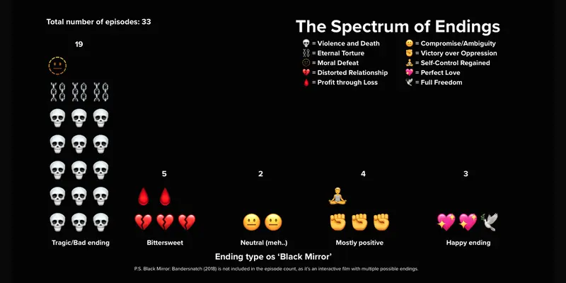
Last year, the developer team at Punch Up took on the role of storytellers-meets-designers, creating works under the theme Movies & Animations (see here) to explore new possibilities in how we work.
This year, we came back — bigger than ever — by getting the entire office to take five days off from regular work(!) to create whatever we’re passionate about, under 3 conditions:
And here are the results...
Scrollytelling website
We all know that most Black Mirror endings are dark and often heart-wrenching. But do these endings affect how much viewers love the series? This project explores whether different types of endings influence IMDb ratings; or if there are other factors that make audiences fall in love with Black Mirror and keep coming back every season.
Pantira Monsumrith (Fhy)
Assistant to CEO
This show has always been one of my biggest obsessions. Black Mirror constantly pushes the limits of what we expect; and that’s exactly why I love it. So I decided to dive into some data about the series and invite you to do the same. If you’ve seen it, maybe.. this will make you feel even more connected to it. And if you haven’t, maybe.. it’s time to give it a shot and join the obsession.
- gathered data from scratch and relied on my own judgment. - made charts!! Used Flourish like I’ve been doing it forever, tried prompting to tweak settings. - non dev web by canva -> journey - AI as my best buddy.
Soooo much fun! I got to play around as a chart expert and test out prompts with Flourish too!
Single page website with interactive map
a process of geographic visualization in reverse
Patiphan Srichai (Fuk)
Data Analyst
I want to try to developing a project that can produce user generated content and also I thought it would be funny
spending time research info & thinking about user experience
europe is such a rich historical region, full of fun and whimsical things 🌈, so many pointless conflict and unnecessary death ✨
Minigame
This started from my obsession with avoiding sneaky UPFs. People rarely flip labels, so I did a 5-day solo sprint to see how “clean” grocery shopping really is. 🚨Spoiler🚨: it’s almost impossible. That pain point turned into an interactive minigame instead of a boring edu-site. Welcome to RED FLAG FRIED RICE fix a “toxic” plate by swapping shady ingredients till it vibes
Soraya Radarit (Noi)
Designer
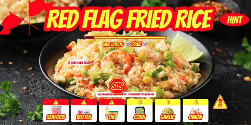
I avoid UPFs, but they’re literally everywhere. Most ppl don’t read labels, and even “healthy” stuff is sus. I went full civilian-mode: did a real grocery run, shot ingredient labels, and realized the system is stacked. So I turned the data into play.
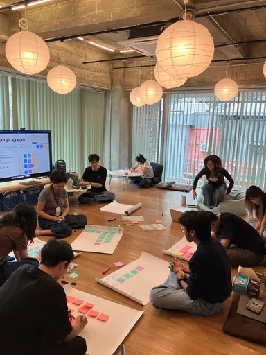
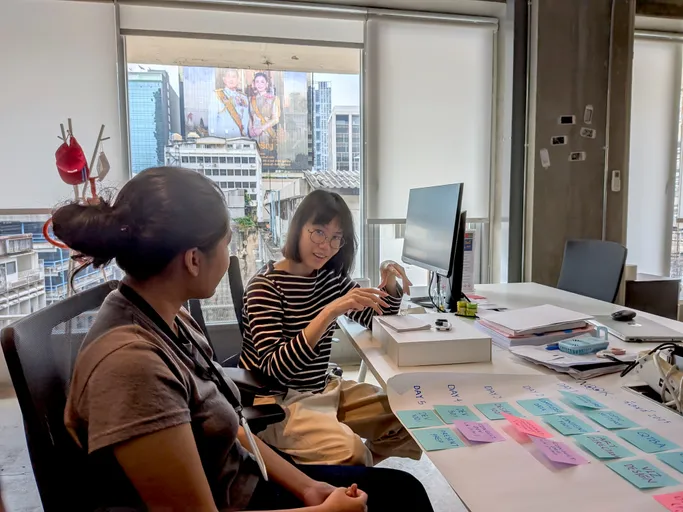
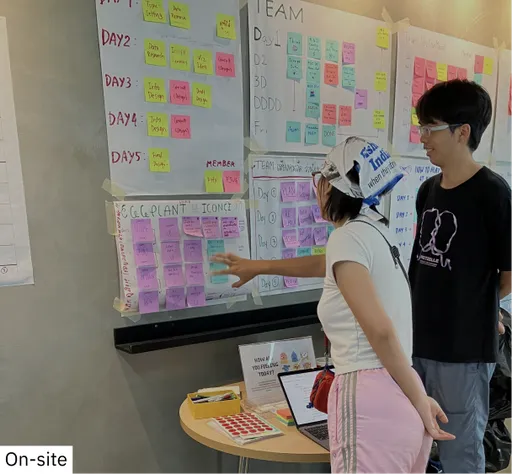
😭Solo project: idea → story → design → dev 😭Collected real-world data myself (no public dataset safety net) 😭Heavy AI collab for OCR, analysis, storytelling, and rapid prototyping 😭Hooked a Google Sheet as my “lazy-API”
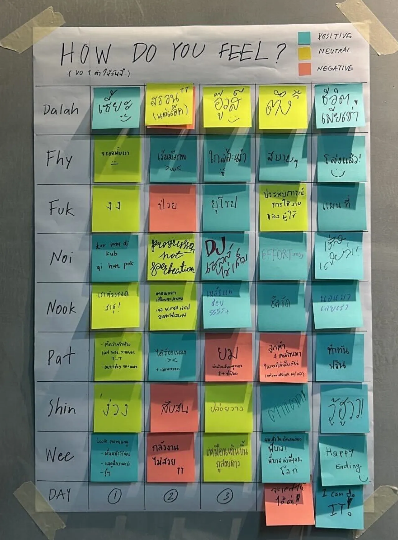
After that grocery heartbreak, I ditched the nerdy text-dump website energy. No one wants to read 2,000 words on emulsifiers and RBD extraction at 11PM. So I turned it into a tiny, chaotic, ⭐️ Introducing RED FLAG FRIED RICE: you start with a cursed “TOXIC” plate and have to swap your way to good vibes by catching all the sneaky UPF villains pretending to be innocent. Because fighting food capitalism needs speed and memes. ⭐️ UPF propaganda → exposed Healthy-washing → cancelled Fried rice → healed
Single page scrollytelling data visualization self expression diary website
Self-reflection on the races I’ve done and comparison with the major race I’d like to achieve.
Chinatip Egkantrong (Shin)
Designer
UTMB before 40.
Front-end dev
No brain, no pain.
Figma prototype / Mobile app prototype
Tired of boring mood trackers? Skip the forms and lifeless icons. Turn your feelings into stunning data art. Fast to use. Fun to see. Feel it, tap it, see it visualized.
Alawee Wamae (Wee) + Worawit Ruengruen (Bas)
Wee - Data Storyteller & Project Coordinator | Bas - Developer
[Wee] Canva is useful, but somehow its free templates limit my creativity. So I want to start designing something from scratch and dig into each step of the design flow, the part I usually just manage and gently nudge designers about when following up on tasks. [Bas] From Wee's brief and direction at a glance, the output of project is possible to be a mobile apps. Since we mostly doing web app in our daily work, I switch to native app using expo for learning purpose, and to answer the usecase requirement of the project.
[Wee] Figma design, User generated data platform [Bas] Expo Native Application and Working with wee for the first time :p
[Wee] Not to brag (maybe just a little, hehe), but pretty sure I’m a fast learner. Aside from checking designers’ work, with zero experience in Figma tools, I managed to pick up the essentials and design a full prototype in one night. Need to know more how I can be just as good at learning coding. [Bas] It was fun with limited timeframe, we finish the feature around 60% of overall requirement.
Scrollytelling
Singing is for fun. But once the contest has begun, why should we lose?
Napat Taetao (Pat)
Data Storyteller & Project Coordinator
It's time for useless, self-centric, zero-social-contribution project. Plus, I love karaoke. 🕺
Design, Onsite data collection, Ultimate informal copywriting (with broken grammar)
Yeehaw
Scrollytelling website
SEA GAMES ARCHIVES is a data scrolltelling project that curates stories and cultural insights surrounding Southeast Asia’s largest multi-sport event — the Southeast Asian Games (SEA Games). In this episode, Meet the Mascots, the project explores the evolution of SEA Games mascots from 1959 to 2025. Through interactive data visualization and storytelling, it traces how each mascot embodies the host nation’s identity, creativity, and values across different eras.
Kornkamon Srivat (Nook)
Data Storyteller & Project Coordinator
I’ve wanted to do something related to sports for a long time, and since this year our country will host the SEA Games, I think it’s a great time to explore this topic. Honestly, I initially wanted to analyze medals or sports performance in the SEA Games, but I didn’t have enough time to collect and prepare the data and I want to focus more on web development instead , so the mascot theme fills that gap. it still represents the sports topic but doesn’t require as much data gathering.
Art direction, Design, Dev, Set up github
Web development is so easy (Just Kidding!). Thank you to ChatGPT and LK for helping me hahaha.
Scrollytelling website
3 Unzipped Secrets 🔥 you must know about 'SAI-FOH' SAI-FOH Insight is the space where we will take you to explore data on marriages between Thai women and foreigners, from the national overview down to popular provinces and partner-selection behaviors across different periods.
Anchisa (Dalah)
Project Assistant
I have always been driven by a deep passion for social science, and the phenomenon of Thai women marrying Western partners has long been a subject I hoped to explore more meaningfully.
Lots of things, including data analysis, choosing charts, 0-1 design, and using various data visualization platforms that are not typically used in the role of PR girl.
Appreciate the taste of life
Activities: